
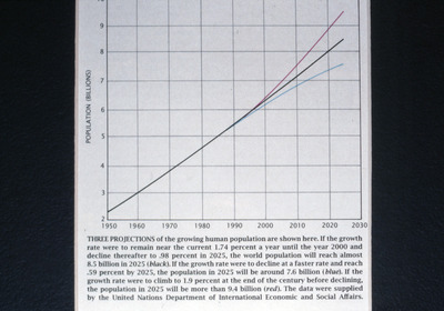
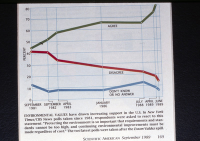
-

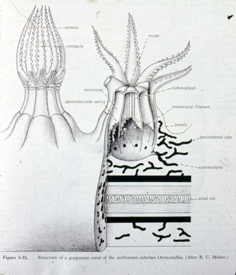
Diagram, Structure of a Gorgonian Coral Polyp and Coral Skeleton, 1997
Barnes
A detailed diagram showing the structure of a gorgonian coral polyp, a member of the subclass Octocorallia. The illustration includes labeled features such as tentacles, mouth, mesentery, and gastrovascular cavity. The cross-sectional view shows internal structures including the coenenchyme and axial rod.
-

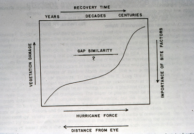
Graph, Vegetation Damage, Hurricane Force, and Recovery Time, December 1991
Ackerman
Graph showing hurricane force, distance from eye, importance of site factors, vegetation damage, recovery time (in years, decades, centuries), and gap similarity.
-

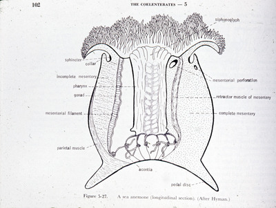
Diagram, Longitudinal Section of a Sea Anemone, Undated
Barnes
A labeled diagram showing the longitudinal section of a sea anemone, highlighting internal structures such as the pharynx, mesenterial filaments, acontia, gonads, and the siphonoglyph.
-

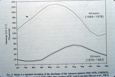
Graph, Discharge of Amazon Orinoco Rivers, 1969-1978
Frank E. Muller-Karger
A graph of mean standard deviation of the discharge of the Amazon (1969-1978) and Orinoco (1979-1983).
-

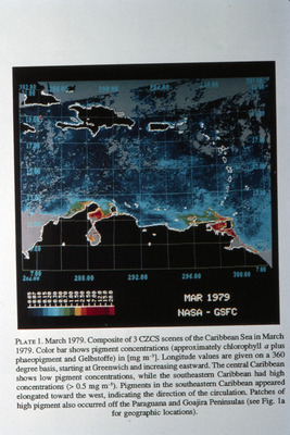
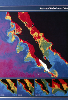
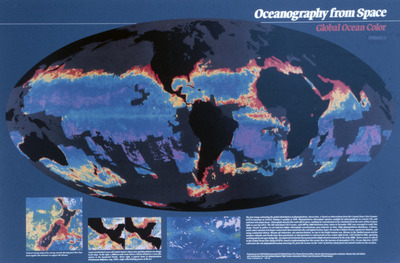
Map, Caribbean Sea Coastal Zone Color Scanner, March 1979
Frank E. Muller-Karger
Composite of 3 Caribbean Sea Coastal Zone Color Scanner (CZCS) scenes of the Caribbean Sea in March 1979.
-

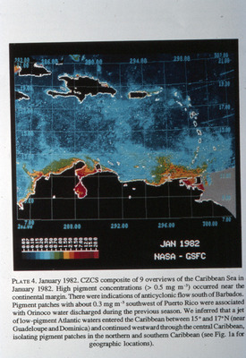
Map, Coastal Zone Color Scanner of Caribbean Sea, January 1982
Frank E. Muller-Karger
Coastal Zone Color Scanner (CZCS) composite of 9 overviews of the Caribbean Sea in January 1982.
-

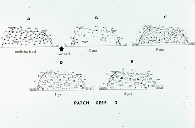
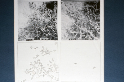
Diagram, Recovery Stages of Patch Reef Two Over Four Years, Undated
John C. Ogden
on from undisturbed, to cleared, and the subsequent changes in reef composition at 3 months, 9 months, 1 year, and 4 years after clearing.
-

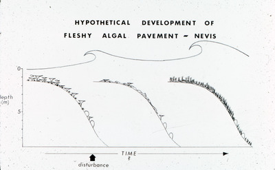
Graph, Hypothetical Development of Fleshy Algal Pavement, Nevis, Undated
John C. Ogden
A graph showing the hypothetical development of fleshy algal pavement over time, including the impact of disturbances. The graph depicts algal growth along a gradient of depth from 0 to 5 meters.
-

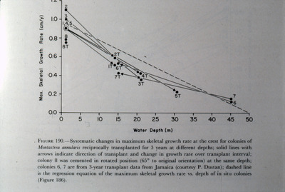
Graph, Maximum Skeletal Growth Rate vs. Water Depth for Montastrea annularis, Undated
John C. Ogden
Graph showing the relationship between maximum skeletal growth rate and water depth for Montastrea annularis colonies transplanted across different depths over three years. Solid lines indicate transplant direction and growth changes.
-

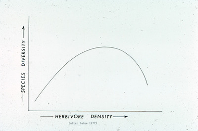
Graph, Relationship Between Herbivore Density and Species Diversity, Undated
John C. Ogden
A graph illustrating the relationship between herbivore density and species diversity.
-

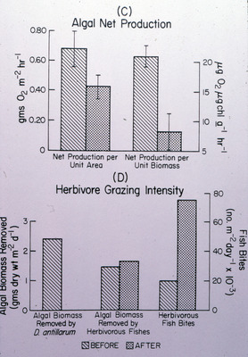
Graphs, Algal Net Production and Herbivore Grazing Intensity Before and After Mass Mortality of Diadema antillarum, Undated
John C. Ogden
Graph comparing algal net production and herbivore grazing intensity before and after the mass mortality of Diadema antillarum. The graphs display differences in net production per unit area and biomass, as well as algal biomass removed by sea urchins, herbivorous fish, and fish bite intensity.
-

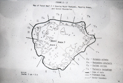
Map, Patch Reef Three with Major Features and Sector Boundaries Undated
John C. Ogden
A map displaying Patch Reef 3, indicating major features such as Acropora palmata, Montastrea annularis, Porites porites, and Thalassia testudinum. The map also highlights sector boundaries, transect lines, and the edge of the reef halo.
-

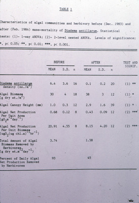
Table, Characteristics of Algal Communities and Herbivory Before and After Mass Mortality of Diadema Antillarum, Undated
John C. Ogden
A table comparing various characteristics of algal communities and herbivory before and after the mass mortality of Diadema antillarum. The table includes data such as urchin density, algal biomass, canopy height, net production, and percentage of daily algal biomass removed by herbivores.
-

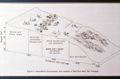
Diagram, Generalized Physiography and Zonation of Bird Key Reef, Dry Tortugas, April 1, 1989
Walter C. Japp, William G. Lyons, Phillip Dunstan, and John C. Halas
A diagram illustrating the physiography and zonation of Bird Key Reef, Dry Tortugas. The reef features distinct zones including rubble and fleshy algae, octocoral-dominated hardgrounds, mixed hardgrounds and sediments, and spur and groove formations.
-

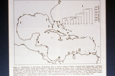
Map, Classification of Coral Faunae from 12 Western Atlantic Locations, April 1, 1989
Walter C. Japp, William G. Lyons, Phillip Dunstan, and John C. Halas
A map showing coral faunae classification from 12 western Atlantic locations, with a dendrogram highlighting the similarity levels between coral regions.
-

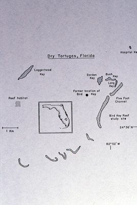
Map, Location of Bird Key Reef, April 1, 1989
Walter C. Japp, William G. Lyons, Phillip Dunstan, and John C. Halas
A map showing the location of Bird Key Reef and geographical features of the Dry Tortugas in Florida.
-

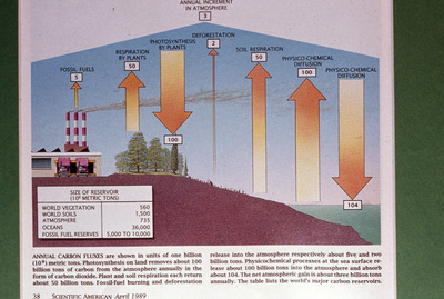
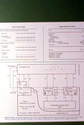
Diagram, Annual Carbon Fluxes and Reservoirs, April 1989
Scientific American
A diagram illustrating the annual carbon fluxes in the global carbon cycle, highlighting the sources and sinks of carbon dioxide. The image depicts processes such as photosynthesis, soil respiration, fossil fuel burning, and physico-chemical diffusion between the atmosphere and oceans.
-

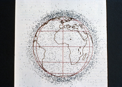
Diagram, Satellite Schematic of Orbital Debris Around Earth, September 1989
Scientific American
A diagram illustrating the schematic distribution of orbital debris surrounding Earth. The diagram shows numerous debris pieces concentrated in various orbital paths, highlighting the issue of space pollution caused by defunct satellites and other space objects.
-

Graph, Average Annual Fertilizer Consumption by World Region, September 1989
Scientific American
A graph depicting the average annual fertilizer consumption in million metric tons for various world regions, including South America, Africa, Asia, U.S.S.R., North and Central America, and Europe.
-

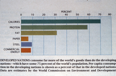
Graph, Consumption of Global Resources by Developed Nations, September 1989
Scientific American
A bar graph illustrating the percentage consumption of various global resources by developed nations.
-

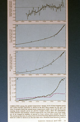
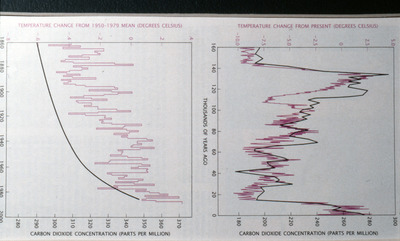
Graph, Correlation Between Global Temperature, Greenhouse Gases, and Carbon Production, April 1989
Scientific American
A graph illustrates the correlation between global temperature changes, atmospheric concentrations of carbon dioxide and methane, and annual carbon production from 1850 to 1990. Four subgraphs depict the temperature deviation from the 1950–1980 mean, CO2 and methane concentration trends, and the increase in carbon production due to fossil fuel burning and land-use changes over time.
-

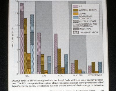
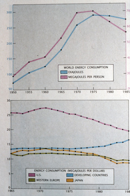
Graph, Energy Consumption by Source and Region, September 1989
Scientific American
A graph showing energy consumption across various regions, including the United States, Western Europe, Japan, and developing countries. It compares the consumption of energy sources such as oil, gas, coal, nuclear, and hydropower, categorized by electric power, residential and commercial, industrial, and transportation sectors.
-

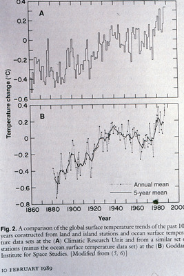
Graph, Global Surface Temperature Trends from Land, Island, and Ocean Stations, February 10, 1989
Scientific American
A graph depicting the global surface temperature trends over the past century from land, island, and ocean stations.
-

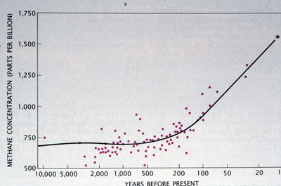
Graph, Methane Concentration Over Time, September 1989
Scientific American
A line graph illustrating methane concentration in parts per billion (ppb) over the past 10,000 years.
-

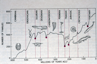
Graph, Number of Families Over Geological Time Periods, September 1989
Scientific American
A graph illustrating the number of families of organisms over geological time periods, including the Cambrian, Ordovician, Silurian, Devonian, Carboniferous, Permian, Triassic, Jurassic, Cretaceous, and Tertiary periods. The chart shows the rise and fall in diversity, with visual representations of notable fossil groups.
Printing is not supported at the primary Gallery Thumbnail page. Please first navigate to a specific Image before printing.
